title design... in more detail
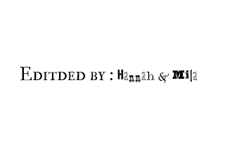
Some of the fonts we were planning on using in our film include Alta California, IM FELL Double Pica SC, and Juniper Std. For Alta California, we would use it when we show our names. For example, when we write “Edited by: Hannah and Mila” it would be used on “Hannah and Mila.” It is a sticker-like decorative font that has a rugged look to it. It relates to the film we are creating because it is a story about a girl who has a rugged life and mentality. Also, the font has a youthful feeling attached to it which correlates to how the film is made about teenagers. It also has a scary and mysterious feeling to it, which matches the overall tone of the film. It relates to our thriller genre and emphasizes the mood that we are trying to implement. For IM FELL Double Pica SC, we would use it for the title descriptions. For example, when we write “Edited by: Hannah and Mila” it would be used on “Edited by.” It is a serif small caps font with a rugged, traditional, and sophisticated appeal. We researched and found that serif fonts allow an audience to read quicker so we thought since we can't have the title for too long it would be nice for viewers. Also, we wanted to reflect the genre with the traditional and sophisticated feel and perception of a thriller. Additionally, it helps to not give an overcrowded or messy look because the other font is artsy. The simpleness of this font helps to balance it out.
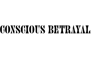
Finally, for the Juniper Std font, it would be utilized where we write the film’s title. It would be used when we write “Conscious Betrayal.” This font is decorative and all caps. It is a bold and strong fought with a little of a mysterious feeling to it. We wanted to add that to our title because it was making it feel important and part of the genre. It is a good way to introduce our film that is also bold and serious itself. As for the title, we feel that we chose the right title because conscious, specifically meaning the perception of someone’s self, life, and experiences, reflects the film. We are trying to show the audience that the main character's perception of life is being distorted by some type of set-up and people around her. She’s driving herself insane and others are also. Also, “betrayal” because it’s been caused upon her by the people closest to her and herself. We also wanted to make the title black because it is the color that will contrast with the background the most. It will make the title pop out more. It will also be a large and easy-to-read size so the audience can immediately understand that this is the film title. It’s important for the audience to see the film title because this way, they can get an idea of what the film will be about and what to expect.
As for how the titles will enter and leave the screen, we were thinking to use a “reveal” transition. This means the words will slowly fade into the screen and they will do the same and fade out when they are exiting the screen. Each title should be on the screen for about two seconds, a maximum of four. This way, the audience has just enough time to read them and so we don’t spend too much time on this part and are able to include more of our film. The movie title will of course be the title that spends the most time on the screen. It should be there for about four seconds. We will also try to include some of the titles into the setting. For example, in a window or on the pillow of a bed. This creates a mysterious mood because the titles are almost “hidden” and helps set the overall tone for the film.


Comments
Post a Comment